One of the central services that we provide clients with is help in dating (not in the Tinder sense of course!). This is objectively establishing the most likely timeframe within which an artwork was created. Our primary approach here is to look at the material elements of the artwork, using what we know about changes […]

One of the central services that we provide clients with is help in dating (not in the Tinder sense of course!). This is objectively establishing the most likely timeframe within which an artwork was created. Our primary approach here is to look at the material elements of the artwork, using what we know about changes in availability of components like pigments and binding media to infer the most probable temporal origin. This forms the basis of much scientific authentication since an obvious first step is to determine whether something credibly originates from the lifetime of the supposed artist.
How do we go about this?
First, we need some suitable data, which generally means collecting information like results from ‘clocks’ such as radiocarbon dating and dendrochronology, or – more commonly – the identification of specific materials where we know when they came into and fell out of use and thus allow us to infer a date. On top of this we can also exploit patterns in artistic practice such as characteristic methods of preparing canvas and panel supports, which also go in and out of favour over time. The narrower the timeframe within which something was used, the more temporally precise we can be about an object we find it in. (The overlap between one material going out of use and another coming in can serve the same function.)
In the past, scientists would refer to ‘terminal’ dates, which are like fixed endpoints to availability, as a means of bracketing production. Today we have a more sophisticated way of looking at this, which is to express the presence of a material as a ‘likelihood’. Intuitively this can be seen as reflecting the availability of the material over time – soon after something is discovered there is going to be very limited availability and therefore little likelihood of finding it used, whereas when it becomes ubiquitous it will be frequently encountered in objects.
Let’s look at a simple example, where we take various sorts of information as proxies for the actual pattern of usage:

Before explaining what exactly this graph depicts, a quick word on our use of these to present chronologies generally. Obviously the lower (x) axis represents the date, so we have a sequence of events year-on-year. We won’t typically use a date period less than a year as it is rare to have more precise information. (An exception would for instance be Vincent van Gogh, where his diaries often allow his paintings to be attached to a specific day.) The vertical (y) axis represents an amount of something, such as quantity of a material manufactured, or number of cases, or (importantly for us) how likely something is. However, we are less concerned with the units (metric tonnes, count of occurrences, …) than in the relative changes, such as whether something is unlikely or very likely, and how this fluctuates over time. To show this we ‘normalise’ the data, putting everything onto a common arbitrary scale; we can then see more easily if, say, peak production correlates with most frequent mention in books.
For the introduction of titanium dioxide whites, I’ve considered five ‘theses’ (scenarios) here, ranging from dates of discovery and commercial introduction, through to hard data on commercial production volume, citations in literature and actual occurrences in paintings. None is perfect – for the first two, say, we are also assuming that titanium white becomes immediately ubiquitous, which is not the case. Commercial production is based here on US data for imports and exports, so of arguable relevance for elsewhere in the world. Literature references can be unbalanced by changes to how the material is being discussed (as a novel material, a common product, or something that was used historically), including changes to terminology. Identifications in artworks can be the most problematic of all because there is often a paucity of analyses, poor object metadata (who, when and where a painting was produced), bias in works selected, plus the production of art varies over time. Nevertheless, with care and close consideration we can build informed and informative chronologies that we can then use in turn to estimate when an object containing the specific material could have come from. It is on this basis that we can then for instance discount paintings supposedly of the 1910s if they contain titanium dioxide white – in practice, we do not expect to find this pigment until the 1940s or 50s.
Nonetheless, this has proven to be a vitally important way of thinking about object dating, as it allows us to do three key things: first, we can look at patterns of use, the comings and goings, like with the titanium white example above, and not just when something might have been introduced or disappeared. Second, we can combine data in a fully rational manner to (for instance) improve our date estimates. Third, we can radically extend what we use and incorporate as dating evidence. And we could in principle add a fourth: extending the concept to geography, so we can track patterns of material use across both time and space.
Having given an example of a material chronology, I want to wrap this blog up with a further example showing how we can use these in practice, so let’s walk through a simple exercise.
To calculate a date likelihood across multiple chronologies we simply multiply them together. For example, if we have two overlapping chronologies, one falling out of use and the other coming into wider employment, we will find that the date falls narrowly where they cross (this might happen if we had, say, both lead tin yellow and Prussian blue in a painting).
Here is an example where we had three pieces of evidence – a radiocarbon date for the canvas, along with the presence in the paint of so-called ‘handmade’ Prussian blue and lead antimony oxide (Naples yellow):

And there we have it, a straightforward way of estimating when a painting was created based on evidentiary data. (We also usually calculate the date range within which 95% of the likelihood falls, so that we can give a clear boundary.) And if more information comes to light, we can add that in, such as when art historical research reveals a pictorial source of known date. For instance, in the case on which I based the example above, we knew there was a primary version of the image created in 1784; we could then date this version to 1784-1813, which hugely helped narrow down the hypothetical range of artists.
Of course, in practice there is more to be considered – construction of high-quality chronologies is a not insignificant task, with the need to consult multiple kinds of data sources, assess their reliability, clean the collected data and integrate it, check for biases and robustness, and so forth. However, by now we’ve built a lot of these chronologies, so know the territory well, from where to get the data from to how best to convert it into a meaningful sequence. Further, our extensive knowledge of the material history of art has allowed us to not only build a range of datasets for the more common materials, but also how to refine these to take advantage of more subtle things like historical changes in manufacturing technology, such as the transition from cruder to more refined chemical forms of Prussian blue, or the commercial use of the anatase and rutile forms of titanium dioxide white. Changes in artists’ material practice is also covered, such as the many and varied forms of preparatory layer applied to panel and canvas supports.
Alongside this we’ve been writing software tools that simplify building and using these chronologies in client projects. We are now integrating this technology into our new digital platform to make it much more widely available. That is, if you have good material analytical data on your painting, you will soon be able to rapidly estimate artwork dates for yourself – just one of a suite of tools supporting robust and independent object assessment we’re developing to fulfil artworld needs.
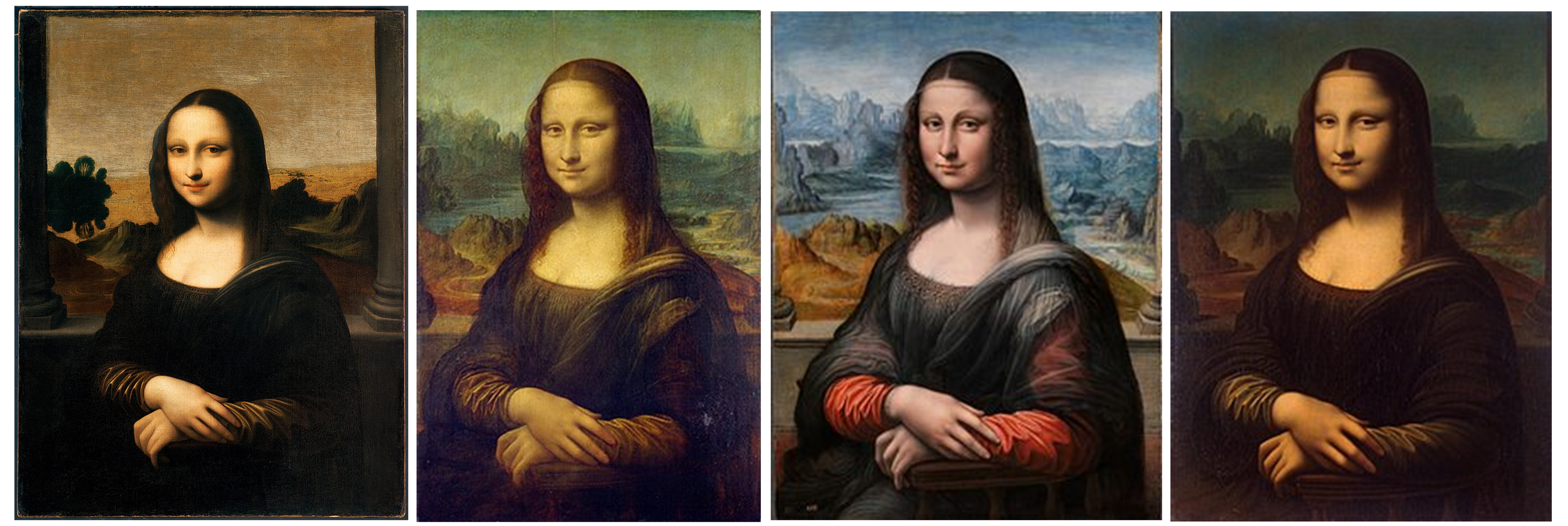
Part 2 of this blog will look at a specific case study in more detail, the instance of the disputed Isleworth Mona Lisa, which some claim was painted by Leonardo da Vinci earlier than it’s more famous sibling in the Louvre. Join us next time to discover if that stacks up.